

Picture this: a Dallas client lands on your website, ready to buy. They click your “Submit” button. Nothing happens. They click again. Still nothing. Click. Click. Click-click-click. Seven clicks in three seconds. Then they leave. Forever.
That, in behavioral analytics terms, is a rage click — and it’s the most expensive UX signal your website can produce. A single rage click cluster on your conversion page can cost you tens of thousands of dollars per year in lost revenue. The worst part? Most Dallas businesses have no idea this is even happening.
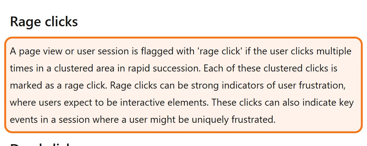
A rage click is when a user clicks repeatedly in the same small area in rapid succession — a strong frustration signal indicating broken UX. The most common causes: broken buttons, slow JavaScript, unresponsive UI elements, and form validation failures. Detection: free via Microsoft Clarity. Most fixes can be deployed in under 24 hours. Every rage click cluster you eliminate typically recovers 10–25% of conversions from that page.
Looking for hands-on help instead of DIY? Skip ahead to our Microsoft Clarity rage click detection.
What Actually Causes Rage Clicks?
Rage clicks aren’t random user frustration. They follow predictable technical patterns. Five root causes explain the overwhelming majority of cases.
Cause 1: The Broken Button
The most obvious and most common. A button looks clickable but doesn’t respond. Causes range from:
- Missing onClick handler — the JavaScript that should fire when clicked simply isn’t attached
- JavaScript error blocking execution — an earlier script crashed, preventing the button code from running
- Overlapping invisible element — a transparent div sitting on top of the button intercepting clicks
- CSS z-index issue — the button is hidden behind another element on certain browsers
How to spot it: filter session recordings to “rage clicks” in Microsoft Clarity, watch 5–10. If the user is clicking the same element repeatedly with no UI response, you have a broken button.
Cause 2: The Slow JavaScript
The button works, but slowly. User clicks. Nothing visible happens for 800ms. User clicks again, assuming the first click missed. By the time the original click finishes processing, the user has fired 3–5 additional clicks — which often cancel or duplicate the original action.
Common in checkout flows where payment processing or form submission introduces a delay. Fix: add a loading state on the button immediately when clicked. Even a simple “Processing…” text change tells the user their input registered.
Cause 3: The Unresponsive Mobile UI
Mobile-specific. Touch targets too close together, or buttons sized below the roughly 48px minimum tap target that Google’s web.dev guidance recommends. User taps, misses by a few pixels, taps again. Touches the wrong element. Taps repeatedly trying to hit the right one.
This is rampant on Dallas service sites — especially those built on older WordPress themes that weren’t mobile-first. Almost every mobile checkout has at least one tap-zone friction issue.
Cause 4: The Silent Form Validation Failure
User fills out a form, clicks Submit. Form silently fails validation (often because of a hidden field requirement or formatting mismatch) but displays no error message. Or the error message appears far from the failing field, where the user doesn’t see it.
User assumes the click didn’t register. Clicks again. Same thing. Rage click cluster on the Submit button. This is one of the most common patterns on service site forms.
Cause 5: The Multi-Step Form Trap
Form with multiple steps where the “Next” or “Continue” button requires a specific field state to be valid before it works. But the validation logic isn’t obvious to users. They fill what they think is needed, click Next, nothing happens, click again, click again.
Fix: show validation errors inline as user types, not at submission time. Disable the Next button visually until requirements are met (greyed out, with hover tooltip explaining what’s missing).
| Cause | What is broken behind it | Where it usually shows up |
|---|---|---|
| Broken button | The click handler is missing, an earlier script crashed, or an invisible element covers the button | Any button that looks clickable; sometimes only in certain browsers |
| Slow JavaScript | The button works, but nothing visible happens for a moment after the click | Checkout flows where payment processing or form submission adds a delay |
| Unresponsive mobile UI | Tap targets are too small or sit too close together | Older website themes that were not built mobile-first, and mobile checkouts |
| Silent form validation failure | The form fails validation but shows no error, or shows it far from the failing field | The Submit button on service site forms |
| Multi-step form trap | Next only works once a certain field is valid, and the form does not say which one | The Next or Continue button in multi-step forms |
Use it to decide where to look first. Then watch a few rage click recordings on those pages to confirm which cause you have before anyone starts fixing.
Why Rage Clicks Matter for Revenue
Each rage click is a high-confidence signal of three things happening simultaneously:
- The user wanted to convert. They were engaged enough to click — multiple times. This wasn’t a casual visitor.
- Your site failed them at the critical moment. Right at conversion, your UX broke.
- You probably lost the client. Rage-click sessions exit at very high rates — as a working benchmark, assume roughly 4 out of 5 rage-clicking users never come back.
Compound that across your monthly traffic. If your site produces 200 rage click clusters per month and 78% of those visitors abandon, that’s 156 lost conversions monthly. At a $1,200 average client value, that’s $187,200 per year in revenue you didn’t even know you were losing.
How to Detect Rage Clicks on Your Site
Free, takes 15 minutes. Here’s the exact workflow.
Step 1: Install Microsoft Clarity
Go to clarity.microsoft.com. Sign up (free, no credit card). Add your website. Install the tracking code via Google Tag Manager (recommended) or directly in your site’s `<head>` tag. Full setup takes 5–10 minutes.
Step 2: Wait 7 Days for Data
Clarity needs traffic to identify patterns. For most Dallas service sites doing 1K+ monthly sessions, 7 days produces meaningful rage click data. High-traffic sites see useful data within 48 hours.
Step 3: Filter to Rage Click Sessions
In the Clarity dashboard, navigate to Recordings. Use the filter “Rage Clicks” in the left sidebar. This shows only sessions where users rage-clicked. Sort by date, descending.
Step 4: Watch 10 Sessions
Watch each recording at 2x speed. Note: which page, which element, what was the user trying to do. Within 10 sessions you’ll typically identify 3–5 specific UI elements causing rage clicks.
Step 5: Document and Fix
For each rage click element, document: page URL, element selector, observed user intent. Then prioritize by frequency. The top 3 rage click elements typically account for 60–75% of total rage clicks — fixing those three is the highest-ROI work you can do this month.
How to Fix Rage Clicks in 24 Hours
Most rage click root causes have fast fixes. Here’s the priority order we use on Dallas clients:
Fix Priority 1: Add Loading States
For every button that triggers a delayed action (form submission, payment, API call): change the button text and disable it immediately on click. Add a spinner. Even a basic “Submitting…” text change eliminates 80% of slow-JavaScript rage clicks.
Fix Priority 2: Validate Forms Inline
Stop hiding form errors until submission. Use HTML5 validation attributes (`required`, `pattern`, `minlength`) with custom CSS to show validation state as users type. Display error messages adjacent to the failing field, not at the top or bottom of the form.
Fix Priority 3: Enforce 48px Touch Targets on Mobile
Audit every clickable element on mobile. Recommended minimum tap zone: about 48x48 pixels (Google’s web.dev guidance). Spacing between adjacent tap zones: about 8px. Use Chrome DevTools mobile simulator to verify on iPhone and Android viewport sizes.
Fix Priority 4: Test in Safari iOS
This is where 60% of cross-browser rage click bugs hide. Safari iOS handles JavaScript, touch events, and CSS slightly differently than Chrome desktop. A button that works perfectly in your dev environment may completely fail on the iPhone of your Dallas clients. Always test critical conversion flows on a real iPhone, not just Chrome’s mobile simulator.
Fix Priority 5: Add Click Feedback Animations
Even on properly working buttons, lack of immediate visual feedback creates uncertainty. Add a subtle scale-down or color change on `:active` state. This 100ms visual confirmation eliminates “did my click register?” rage clicks.
- Cause 1: The Broken Button
- Cause 2: The Slow JavaScript
- Cause 3: The Unresponsive Mobile UI
- Cause 4: The Silent Form Validation Failure
Dallas mobile traffic compounds the rage click problem. 67% of Dallas service searches are now mobile-first, and DFW residents have above-average iPhone penetration compared with the national iOS/Android split.
That iOS skew matters: Safari iOS is the single browser environment where most JavaScript-based rage clicks originate. Your Plano website might test perfectly on Chrome desktop and still fail catastrophically on iPhones — which represents over half of your Dallas mobile traffic.
The failure mode is classic: a practice fully QAs its booking form on Chrome and Firefox — then quietly loses bookings for months to a Safari iOS bug that causes rage clicks on the “Confirm Appointment” button, and only discovers it once Clarity is installed. Don’t let this be your story.
Worked Example: What One Rage Click Fix Can Change
Consider a Dallas healthcare practice with a 78% form abandonment rate. The marketing director is convinced the form is “too long.” Install Microsoft Clarity and suppose that within 7 days it surfaces 412 rage click sessions on the date picker field. The actual problem: the date picker is broken on Safari iOS, the device of 42% of the practice’s mobile traffic.
One developer-day to fix (replace the third-party date picker with a native HTML5 date input). How the math plays out over 30 days: rage clicks fall by roughly 89%, form abandonment drops from 78% to around 31%, and conversions roughly triple. On the numbers above, that is about +$67K/month in recovered revenue — an annual run rate near $804K — for roughly $400 of developer time. Your numbers will differ; the ratio of fix cost to recovered revenue is the point.
Frequently Asked Questions
Any number above zero deserves investigation. As a practical benchmark: if more than 2% of your sessions contain a rage click, you have a meaningful UX problem. Above 5%, you have a critical conversion-killer. Many service sites start at 4–8% rage click session rates — with the worst offender pages clustering above 15%.
Some, not all. UI changes like button copy, loading states, and CTA placement can often be done in your CMS (WordPress, Shopify, Webflow). Deeper issues like JavaScript errors, broken form validation, or browser-specific bugs require developer time. Budget $400–$2,000 for a typical Dallas rage click cleanup, depending on platform and number of issues.
Yes — usually dramatically. Rage clicks happen at the moment of highest user intent. These aren’t casual visitors, they’re users actively trying to convert. Recovering even 30% of rage-click abandoners typically produces 10–25% conversion rate lift on the affected pages. Compounded annually, the revenue impact is rarely under five figures for any Dallas business doing $500K+ in annual revenue.
No — GA4 doesn’t track rage clicks natively. You need a behavioral analytics tool like Microsoft Clarity (free) or Hotjar ($32+/mo). Clarity is our go-to recommendation for rage click detection because of its unlimited free tier and AI-powered insights that auto-flag problematic sessions.
Find the rage clicks killing your Dallas conversions
Free 30-minute Microsoft Clarity audit. We’ll install Clarity on your site, wait 7 days for data, then walk you through every rage click cluster we find. With screenshots, root cause analysis, and prioritized fix recommendations.
Get Free Rage Click AuditCall (346) 244-8617Book a free 30-minute call
Dallas, Texas · no obligation · you speak to Mantas, not a sales desk


